Wednesday, 28 July 2021

Celebrating with Dr Kate Hall

Last week saw AUB’s graduation ceremony and we got to celebrate with our good friend Dr Kate Hall.  Kate was MoDiP’s first associated student and completed her PhD in the academic year 2019/2020 but because of the COVID restrictions AUB didn’t have a ceremony last year and decided to celebrate both 2020 and 2021 finishers this year over three days.

Dr Kate Hall.  Image credit: Louise Dennis

Kate’s inquiry examined the place of creative writing in the wider context of design writing. She explored the relationship between poetry and designed objects and how poetry impacts on the ways in which we respond to them. Her work has developed new methods of research and a concept of Design Poetry that critically articulates both designer and user experience through the medium of creative writing and poetry in particular. In her research, her own poetry has rested a lens on the plastic chair ­– an object, everyday and ordinary, yet having the potential to be extraordinary.  You can find out more about Kate’s work on the research pages of our website and see some of her work on the residencies page.

The famous walk across the stage. Image credit: Louise Dennis
  

The weather was beautiful and graduation is always special but this year it was particularly special for the MoDiP team.  Huge congratulations to Kate from all of us, and we wish her well with her future endeavours. 


Louise Dennis

Curator of MoDiP

Wednesday, 21 July 2021

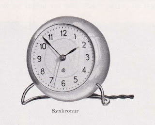
Alarm Clock, Arne Jacobsen, 1939.

Arne Jacobsen (1902 – 1971) was a Danish architect and designer, although apparently he would not want to be called the latter as he famously disliked the term. His industrial designs usually came about through his architectural projects, such as at the SAS Royal Hotel, where he designed both the building and its internal fittings including chairs, textiles, door handles, ashtrays and cutlery. His collaborations with manufacturers like Fritz Hansen (eg. the ant, egg and swan chairs) and Louis Poulsen (eg. the AJ lamp) have become sought after classics with Jacobsen now widely recognised as one of the pioneers of twentieth century Scandinavian modern design.

Image ref: Jacobsen standing in front of the SAS Royal Hotel
Image credit: https://www.scandinaviastandard.com/the-complete-artwork-of-arne-jacobsens-sas-royal-hotel-in-copenhagen/


As Jacobsen was not currently represented within MoDiP’s collections, I began to research his catalogue of work to see if there were suitable objects that we could acquire. I discovered that some of his well-known armchairs did actually employ a moulded plastics frame as well as synthetic foams for comfort, but I thought it might be difficult for MoDiP to display these as the parts we would be most interested by would be hidden and there was no way I was going to cut one in half in order to see the innards!


Image ref: AIBDC : 008680
Image credit: Katherine Pell


And then I came across his alarm clock. Not as well-known as his three metal wall clocks: Roman (designed for the Aarhus Town Hall in 1942), City Hall (designed for the Rødovre Town Hall in 1956) and Bankers (designed for the National Bank of Denmark in 1971), this smaller, electrical mantel clock was made of compression moulded phenol formaldehyde and so perfect for MoDiP. It was originally designed by Jacobsen for the house he had also designed for H. J. Hansen, the director of Lauritz Knudsen, a Danish electrical appliance manufacturer. It was exhibited at the spring fair in Charlottenborg, Copenhagen, in 1939 and can be seen on the desk in the image below, taken at that display.


Image ref: The original clock on display at the Charlottenborg spring exhibition, 1939.
Image credit:
https://arnejacobsenwatches.com/uk/the-story-behind-the-watches


Lauritz Knudsen soon began mass production, offering the clock with nickel-plated legs in either ivory or black colours with Arabic or Roman numerals. It was equipped with a 1.5 metre long cord with a plug that could be connected to a standard light socket for power, and had a luminescent dial and hands.


Image ref: Lauritz Knudsen brochure
Image credit:
https://www.dailytonic.com/arne-jacobsens-table-clock-rereleased-by-rosendahl-dk/


Since MoDiP’s example has a bakelite base instead of the metal legs, I wanted to know when this adaptation to the original design might have taken place but I was unable to source any further information. I reached out to colleagues at the Danish Museum of Science and Technology and Niels Christiansen, Curator of Collections, very kindly sent me some documents from their archive that featured the clock. The first was a Lauritz Knudsen company publication from 1953, with the following translation:

In 1939 LK constructed their first synchronous clock. A small chic table clock designed by Arne Jacobsen. Later this production was expanded with wall clocks in different sizes and also for outside use. In 1948-49 the clock production stopped.


Image ref: The original clock design with metal legs.
Image credit: Lauritz Knudsen 1893-1942. Published 1953, courtesy of the Danish Museum of Science and Technology.


The second was a page
from a 1952 brochure from the clock manufacturer E. Nørgård, København, who took over the production of LK clocks under the name ENK. The original design can now be seen alongside Model 85314 with the bakelite base: MoDiP’s example.


Image ref: The original clock design alongside the version with a different base.
Image credit: ENK Synkronure Katalog No.1. Published 1952, courtesy of the Danish Museum of Science and Technology.


Although I am confident the clock itself is Arne Jacobsen, I am uncertain about the base – was this change from the metal legs his decision or did it come via the manufacturer, Lauritz Knudsen? Or possibly even E. Nørgård when they took over production in 1952? Either way, the Danish Design Museum have confirmed that they also have the same example in their collection, so hopefully we will be able to discover some further detail in the future when they re-open after their refurbishment.

Incidentally, the table clock was re-released in 2011 by the Rosendahl Design Group, who acquired the rights to the design three years earlier. It still has an alarm function but now also includes a light, with the case manufactured in ABS (acrylonitrile butadiene styrene) as opposed to the original bakelite (phenol formaldehyde). Of course, MoDiP has one of those too!


Image ref: AIBDC : 008665
Image credit: Katherine Pell


Katherine Pell
Collections Officer
 
References:
ENK Synkronure Katalog No. 1. Published 1952. Courtesy of the Danish Museum of Science and Technology.

Lauritz Knudsen 1893-1942. Published 1953. Courtesy of the Danish Museum of Science and Technology.

Wednesday, 14 July 2021

An Orange Tree and a Bitter Orange Tree, Practices of Care

Sarah Carne is a London-based independent artist and educator whose practice employs a wide range of forms including video, performance, text, conversation and drawing. She is interested by status, value and rank and how these determine the opportunities we access, the materials we use and how we are perceived. Her latest project 'A bitter orange tree and an orange tree: practices of care' was a collaboration between the UCL Plastic Waste Innovation Hub and Xenia and involved a Citizen Science Project around plastic design, food waste and composting. The book is an anthology of contributions by those involved. 


As an artist I have an ongoing interest in status - how we perceive it, who gets to define it, and by extension how we value things, often according to whether they are considered successful. By following the usual systems of metrics we can end up giving priority and space to those things considered the best whilst not exploring the prejudices that have influenced these systems or the barriers to inclusion that they engender. To put it more simply I am interested in shining a light on things that are overlooked or underrepresented or the spaces where they should be.


I have previously explored these ideas through projects around missing women artists  - I’m Looking for Barbara (https://www.sarahcarne.co.uk/work/im-looking-for-barbara) and This is for Christine Cadin (https://www.sarahcarne.co.uk/this-is-for-christine-cadin) and in a more abstract fashion in Paper and Vegetables, a two year residency at Great Ormond Street Hospital in which I discussed the relative merits of folded paper and various vegetables with patients and their families. I have also just completed a commission for Trellis, UCL’s Public Art programme, which at first glance is about citizen science, composting and biodegradable plastic but is actually about community and care. The outcome of this commission is an anthology An Orange Tree and a Bitter Orange Tree, Practices of Care, that seeks to amplify the voices of the participants and those involved in its production.


The premise of Trellis is to support engagement between artists, UCL researchers and communities in East London. I was drawn to working with Danielle Purkiss and Charnett Chau from UCL’s Plastic Waste Innovation Hub when, during our first conversation, we established that they don’t believe plastic is the enemy, rather that waste in its life cycle is the problem that their research aims to design out. Danielle had previously set up the Big Compost Experiment in which people around the country have been composting biodegradable plastic and submitting their results but she is aware it is being undertaken by people who already have an interest in composting - if not plastic. She was interested, therefore, in running a smaller version for Trellis with a group of people who hadn’t self-selected and as a result might have little or no experience of composting, better reflecting the population as a whole and shedding light on some of the factors that cause people to engage with composting or choose not to.


I was already interested in working with Xenia, a Hackney based organisation for women who are learning English and women who speak English, and the Hub were keen to see if language might be a barrier to the success of some of the changes they are
advocating. Xenia joined us as partners and introduced us to Josie Stevens, the Heritage Learning Manager at Hackney Museum, who they collaborate with, holding their meetings there prior to the pandemic  and using objects in the museum as prompts for conversation.


We decided to run a Citizen Science Experiment and with five members of Xenia set out to test whether plastic advertised as compostable would degrade in home composting bins. Alongside this we ran a series of online sessions with the larger group around topics including citizen science, food waste, plastic and, importantly, space. Most of the smaller composting group were using indoor bokashi bins - finding space for these and the accompanying equipment proved tricky for those of us living in small flats - it is something which the Hub is aware of as England moves towards compulsory food waste collection in 2023.


The outcome of the citizen science experiment in terms of the plastic was inconclusive - we didn’t have time for a full length test and the integrity of what we did was impacted on by the strictures of lockdown but it was still a success, in essence being more about introducing the idea to the group, sparking interest for future composting activity and raising awareness around plastic waste and food waste. It also led to a strong sense of collaboration with the potential for future partnerships for all of us and gave the Hub valuable insight into real life experience of some of the issues around home composting.


The outcome for myself in terms of an artwork is the anthology. Midway during the project I realised that the idea of ‘care’ was becoming central to my thinking. We had been talking about collection care at Hackney Museum having chosen a compostable plastic bag in their collection to discuss during one of our online sessions. When they went to bring it out of the store they discovered it had started composting itself, the object number had detached and the edges were disintegrating. Discussion in the session brought up interesting questions around why a museum collected plastic in the first place and does a damaged item warrant being preserved. This was discussion about care in a practical sense but Josie had also made a short video welcoming the women of Xenia back to the museum virtually and her appreciation of their relationship shone through, echoing how much I knew the women of Xenia cared for each other. 


As a result I asked the Hub researchers, Ioanna Korfiati the Xenia workshop organiser and Josie Stevens to consider care as it affected their work or their role in the project and to contribute short pieces of writing around this. I also conducted a recorded conversation with the composting group and the anthology contains extracts of this and the Saturday sessions. Another key conversation was with Fatima whose first language is Arabic. Her commitment to the experiment was so strong I wanted to give her a chance to talk about it without restriction so arranged for a translator to help us in a conversation and it is from this that the title of the anthology comes. Nathalie Thomas the translator put such thought and effort into her work in ensuring she stayed true to Fatima’s voice I invited her to also contribute. Lastly I invited Charlie Abbott from work-form, the designer of the book, who writes about the questions that need to be asked when making a book with the smallest possible environmental impact. The final essay is by myself and concerns my thinking about why I try not to care about doing my best and trying my hardest.


You can see a PDF of the book here (https://www.sarahcarne.co.uk/work/a-bitter-orange-tree-and-an-orange-tree-practices-of-care) or request a copy via my contact page (https://www.sarahcarne.co.uk/contact)


Sarah Carne 2021


Wednesday, 7 July 2021

Casein

Did you know that you can make your own plastics material at home using milk? 

There are various methods and recipes available online to make casein but essentially all you need to do is heat up some skimmed milk in a saucepan and when warm, slowly add a small amount of vinegar and stir. The milk will separate into curds and whey and then, by straining off the liquid, you are left with a doughy material that can be coloured, moulded into shape and left to dry. It is a fun project for short-lived creations such as Christmas tree decorations because over time the material will likely split and break apart or go mouldy. In commercial casein, these issues are resolved by hardening and preserving the plastic with formaldehyde. 

Casein was first patented in 1899 and, like the other early semi-synthetic plastics, at first it played a key role in imitating natural materials, finding a particular market in successfully copying horn. It was commonly used for small items such as buttons, cutlery handles and knitting needles

There is a lovely story that credits the discovery of this plastic to a cat belonging to German chemist Adolf Spitteler: the pet had knocked a bottle of formaldehyde into its milk which, upon discovery the next morning, had turned solid. How ever this discovery did actually take place, the patent was filed by Spitteler and his collaborator, printer Wilhelm Krische, who had been looking for a way to waterproof paper as an alternative to the slate boards used by schoolchildren in the classroom. Further development of the manufacturing process led to the introduction of casein as a stable, mouldable material under the trade names of Galalith (German/French), Syrolit, Erinoid, Neolyte, Lactoid and Dorcasine (UK), as well as Aladdinite, Karolith, Inda and Ameroid (US) amongst others. 

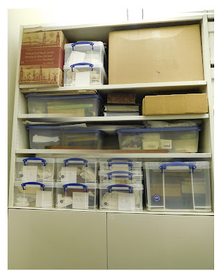
Although MoDiP has a small number of casein objects, we have just recently taken delivery of a whole lot more (see image below) through the private collection of the late John Morgan, a renowned UK casein expert and collector. In due course we will be examining everything in detail alongside the Plastics Historical Society, as we will both be taking responsibility for the long-term care of this superb legacy.
Until such time that we can complete the curatorial tasks of accessioning, cataloguing, photography and re-storing the objects in conservation-grade materials, the collection all needed to be stored away. Just before I did this, I had a quick peek inside some of the boxes and here are just a few of my favourite things: 

Buttons – lots and lots of buttons including blanks and an oversized, extremely heavy, wood-effect, promotional example.
Some lovely dressing table sets, with a close-up of the detail on the mirror back. I particularly love this shade of green.
Several pen sets including the ‘cracked ice’ colour effect seen in the blue example on the right.
Cocktail sticks (left) and a set of six knives (right).
Valuable archival material.
And finally, all of the boxes nicely organised in the museum’s store.
Katherine Pell 
Collections Officer 

References: