Wednesday 26 January 2022

Rotaflex lampshade, John and Sylvia Reid, 1950s.

This gorgeous, small, ellipse-shaped lampshade was recently donated to the collection.
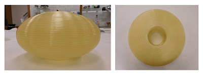
Image ref: The small lampshade, AIBDC : 008834
Image credit: Katherine Pell


We believe it to be part of a floor/table lamp as opposed to a ceiling pendant, although the original attachments are missing – refer image below for a similar, complete example.


Image ref: What we think our shade might have looked like with a wooden stand.
Image credit: https://keup.files.wordpress.com/2019/08/rotaflex-31.jpg


It is very similar to another shade we have, designed by John and Sylvia Reid for Rotaflex in spun cellulose acetate.


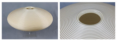
Image ref: Rotaflex large ceiling pendant, AIBDC : 000870
Image credit: MoDiP


The manufacturing method was patented in 1946 by Danish civil engineers Bent Højberg- Pedersen and Bent Panker. It involved first extruding the cellulose acetate plastics material through a nozzle, to create a filament with a circular cross-section. This was then helically wound around a wooden former of the desired shape, with some form of adhesion then applied to adjoin the neighbouring filaments together, such as brushing/spraying with a solvent. Two filaments could be laid down simultaneously, which seems possible for both of MoDiP’s examples as they each possess alternate layers of transparent and opaque strands. This would have produced a decorative effect in use as each layer would display a different degree of light transmission. 

Image ref: A Rotaflex shade being made at a factory in Australia, 1967.
Image credit:
https://www.instagram.com/p/BtzS1n5nlvnYvL21XGQkZhBXZtXsh675KMDkNc0/


It became known as the rotaflex process and was licensed out to other manufacturers by Pedersen and Panker before they set up their own company several years later, also called Rotaflex. To further confuse matters, the Rotaflex (with a small or capital ‘r’) name was often used to brand the shades designed by these different manufacturers, some choosing to adopt the name for their own lighting companies as well!

For example, French lighting maker/manufacturer Pierre Disderot knew Bent Højberg- Pedersen and founded Rotaflex (France) in 1954, launching a range of shades he had commissioned from the studio Atelier de Recherches Plastiques (A.R.P.). Six are featured in the image below, part of a Pierre Disderot Luminaires promotional display in Paris, 1955.

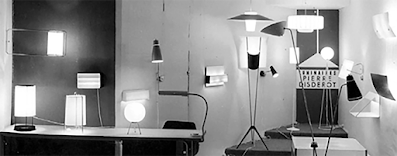
Image ref: Six of the shades in this Disderot display in 1955 feature A.R.P. rotaflex designs.
Image credit: https://postwarbritish.co.uk/disderot-rotaflex-france/


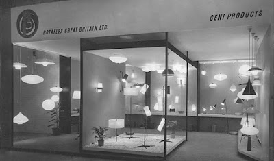
Around the same time, a British lighting company was established by Bernard Stern named Rotaflex (GB) Ltd, that not only made original designs but also manufactured and distributed some of the Disderot/A.R.P. rotaflex shades. It was Stern who commissioned John and Sylvia Reed who subsequently went on to add two of their designs to the Disderot catalogue in 1957.


Image ref: The ‘Metallux’ range designed by John and Sylvia Reed for Rotaflex GB, 1957.
Image credit: https://keup.wordpress.com/2019/08/11/rotaflex/


Other companies were then set up in the US, Australia and across Europe, all of them interconnected, creating their own Rotaflex shades as well as selling each other’s designs. Unfortunately, the shades are rarely marked with the maker’s details but production was prolific throughout the 1950s and 1960s, stopping by the 1970s as the technique fell out of fashion.


Image ref: John and Sylvia Reed with some of their spun cellulose acetate shade designs.
Image credit:
https://postwarbritish.co.uk/john-and-sylvia-reid-exhibition-at-margaret-howell/


If you would like to find out more on the subject, check out the amazing post war british website that features original interviews, archive photographs, exhibition catalogues, promotional advertisements and more.
And not forgetting that the shades were designed in a variety of colours and styles.


Image ref: Some more Disderot rotaflex designs.
Image credit:
https://keup.wordpress.com/2019/08/11/rotaflex/


Katherine Pell
Collections Officer
 
References:

https://collections.vam.ac.uk/item/O1223428/po200-lampshade-reid-john/

Wednesday 19 January 2022

Introducing Lisa Moro, MoDiP Student Creative 2021/2022

My name is Lisa Moro and I am in my final year of the BA Fine Art at AUB and am excited to have been chosen for the MoDiP Student Creative.

Over the last few months, I have been exploring making work using Augmented Reality and my submission to MoDiP was to make work using AR as a medium.


Fertility Games, Lisa Moro, 2001.
Augmented Reality (AR), Bournemouth University Gym.


I was particularly interested in bringing items out of the museum environment and placing them in real world situations.

My previous work has had themes around body parts and domesticity and machines, and with this in mind I have been searching the catalogue to find items which are labour saving devices to work with. Examples of those which I will be looking to use are :


Stick blender, AIBDC : 001478


Iron, AIBDC : 0_1962


For this project I have also been on a steep learning curve extending my skills using 3D and AR software and I have had help from AUB innovation https://aub.ac.uk/industry to explore ways to recreate the items in 3D and am pleased to say I now have this aspect nailed!

 As part of my research into artists using AR I have visited some exhibitions which are currently running, The Seeing the Invisible http://seeingtheinvisible.art exhibition at the Eden Project has work from 12 Artists. Visiting the exhibition gave me a chance to see a range of work and how the technology works in practice and also to consider the visitor experience and signage.


TimTimur Si-Qin, Biome Gateway, 2021.
Augmented Reality (AR), Seeing the Invisible, Eden Project.


My next step will be to digitise the items I will be working with and explore ways to manipulate them. I do not have an end result in my mind yet so am excited to see what emerges over the next few weeks.


Lisa Moro
BA Fine Art

Wednesday 12 January 2022

Introducing Jasmine Baker, MoDiP Student Creative 2021/2022

Hello there!

I’m a current student of BA illustration in my final year at AUB and I’m fortunate enough to be one of MoDiP’s student creatives of 2021/2022.

I’m really passionate about picture books. Why? Simply because there is something joyously magical, and entirely whimsical in illustrations for children. Creating spaces for them to explore, learn and test their imagination, all with the bonus of being able to tell stories! – and needless to say, I’m also really passionate about telling stories.

I’m also wholly enamoured with the quote that “Pictures say a thousand words”.

So it would make sense that my proposed project with MoDiP would be a wordless picture book! – One that concerns itself with how we perceive plastic.

I also set myself three main questions to help me get started :

  • What would a child’s perception of plastic be?
  • What would they think it’s purpose serves?
  • To a child, is plastic inherently positive or negative?

My first idea for a concept, was ‘Treasures’, a tale of a child who upcycles the plastic they find upon the beach (Possibly after an encounter with an upset mermaid, because I love folklore & mythology) which leads to the shoreline becoming a little bit cleaner, and the town, a little bit brighter with their creations.

Which was in part, inspired by MoDiP’s recent exhibition, ‘Beside the sea’ : https://www.modip.ac.uk/exhibitions/beside-the-sea

Here are a few of the sketches:

Wave illustration


Decorative end pages - blue, pink and yellow


But I wanted to scout out multiple different approaches, so I decided to utilise MoDiP’s wonderful collection of objects more consciously for inspiration, because how better to understand plastic, than a whole museum dedicated to it?

Specifically, I searched for objects children might encounter, and these were some of my favourites!

Zolo - Creative building set (top) and assembled (below)


Pipsquigz - Suction based assembly


Roomii - Toy & toy storage


What stood out to me about this collection of objects, aside from a desperate desire to play with them, were their qualities of vivid colours and versatility. Which ended up sparking the inspiration for some pattern-based designs.


I found the simple shapes and colours super fun to experiment with, as they held a deconstructed reminiscence to some of the toys I had discovered.

So my second, and most current idea for a concept, is to explore the world of children’s toys - still within the context of a wordless picture book. With a reminder to myself that this project doesn’t need to be at all conventional. It could be understated and mundane, or ambiguous and surreal and even controversial. It’s an exciting opportunity to explore lots of different possibilities!

Looking forward to the next update, I’ll see you then!

Jasmine Baker
BA Illustration


Wednesday 5 January 2022

GPO 162 pyramid telephone, 1932, Siemens

To ring in the New Year, this week’s blog features one of my favourite objects from MoDiP’s collections: a stunning GPO 162 pyramid telephone. Dated to 1932 and made from compression moulded phenol formaldehyde (bakelite), it sits on a matching Bellset 25 because it did not have an internal bell although, if preferred, the bellset could be wall mounted nearby instead. This example was manufactured by Siemens Brothers (Woolwich).


AIBDC : 008465
Image credit: Katherine Pell


The 162 design appears to be a collaborative effort between the Research Section of the General Post Office and Siemens, when in 1927 the GPO wanted to create a telephone as good as anything then available, but which would not infringe upon existing patents. When released, the Times newspaper noted that the design of the external form closely resembled a set made by the American Telephone & Telegraph Company, but Siemens maintained that one of its engineers had adapted the design from an Edwardian silver ink stand he had recently acquired.


The new GPO microtelephone, without the bellset attached.
Image credit:
http://www.samhallas.co.uk/repository/documents/poeej_new_cb_microtelephone.pdf


The GPO team included A.J.Aldridge, E.J.Barnes and E.Foulger, who conducted extensive experimentation over a number of years to produce a robust instrument ‘of pleasing experience and not easily interfered with by the subscriber’!

For example: the chosen length of the handset was based on the average of measurements taken from a large number of different sized and shaped heads; the 45° angle of the mouthpiece was carefully calculated to prevent the lips from being able to touch it during speaking whilst at the same time maintaining articulation (apparently 90° caused too much discomfort for the user); and the transmitter inset was given a perforated metal guard with the holes set out of line to the holes in the mouthpiece so that there was no possibility for small, foreign objects to be pushed onto the diaphragm.


The mould for the case of a GPO 162 pyramid telephone.
Image credit:
https://www.britishtelephones.com/siemensb/sb162.htm


Drop and user tests were completed to check on the performance of the design, the componentry and the materials, with the first model being released in 1929. It was the UK's first telephone to incorporate both the transmitter and receiver into a single unit and was commonly available in black (phenol formaldehyde/bakelite), Chinese red, jade green and ivory (all urea formaldehyde).


An advert for the Chinese red colour, dated 1934.
Image credit:
https://www.britishtelephones.com/t162.htm


Early, and now extremely rare, versions were also introduced in a mottled brown/walnut colourway, a dark green, a mahogany and a gold and silver coloured lacquer coating, all examples made of bakelite. Some sources also cite a blue phone but there seem to be no images to evidence this ever having gone into commercial production. In addition to urea formaldehyde for the lighter colours (introduced in 1933/34), Diakon, an acrylic (polymethyl methacrylate) developed by ICI, was sometimes utilised from 1936 and both materials appeared through successive telephone designs such as the 300 and 700 series until superseded by acrylonitrile butadiene styrene from the early 1960s.


Some of the other colours, left to right: jade green, ivory, walnut, mahogany, dark green and gold.
Image credit:
https://www.britphones.com/gpo-162s/


MoDiP’s example is marked GPO S-32/234 No.162CB, suggesting the phone originally had no dial as it would have been used on a manual exchange where the operator would make the call connection. It would have been converted for use with a dial on an automatic exchange at a later date, possibly through GPO refurbishment. The No.164 handset is marked GPO S-32/234 within an oval shaped recess and is attached via a brown 3 core plaited cloth cord.


The base markings.
Image credit: Katherine Pell


It is a beautiful object and will be featured in our next exhibition, Why Plastics?, on display from March 2022. If you would like to come into the museum and see it before then, contact us and we can also show you some other lovely phones from the collection too.


Katherine Pell
Collections Officer


References:

https://www.britishtelephones.com/

http://www.britphones.com/

http://samhallas.co.uk/repository/others.htm

https://telephonecollecting.org/Bobs%20phones/index.htm

Aldridge, A.J., Barnes, E.J. and Foulger, E. (1929). A New CB Microtelephone. The Post Office Electrical Engineer’s Journal. Vol. 22. 1929. pp. 185-193 (online). http://www.samhallas.co.uk/repository/documents/poeej_new_cb_microtelephone.pdf. Accessed 31 December 2021.

Emmerson, A. (1986). Old Telephones. Shire Publications Ltd: Bucks.

Cook, P. and Slessor, C. (1998). An Illustrated Guide to Bakelite Collectables. Quantum Books: London.

Holdsworth, I. and Trafford, G. (1998). The Design and Manufacture of the GPO 162 Telephone. Plastiquarian. No. 20. Summer 1998. pp. 8-11

Pearce, C.A.R. (1938). Diakon: a new material for coloured telephones. The Post Office Electrical Engineer’s Journal. Vol. 30. January 1938. pp 292-293 (online). https://www.blunham.com/Radar/SignalsMuseum/PDFs/PostOfficeJournals/POjournalV30Pt4.pdf Accessed 31 December 2021.

Pearce, C.A.R. (1938). The New Combined Hand Microtelephone and Bellset. The Post Office Electrical Engineer’s Journal. Vol 31. April 1938. pp 1-4 (online). http://www.samhallas.co.uk/repository/documents/poeej_new_combined_microtelephone.pdf Accessed 31 December 2021.