Wednesday 30 June 2021

Classic design: Sqezy

In March, MoDiP was invited by the BPF to provide a short series of webinars about classic design inspired by objects in the MoDiP collection.

The object or objects that have inspired the last talk are the Sqezy bottle created by Cascelloid a division of BXL. MoDiP has 19 different bottles in the MoDiP collection which were donated to the us via an employee of BXL along with other objects, and archival documentation including a great resource of photographs showing products, buildings, and equipment. I will share some of these with you as we go along. This is going to be an image or object heavy post which is pertinent of the mass-produced item of packaging and the stories behind them (click on the images to make them bigger). The image below is from an exhibition, Spotlight on 2…, which highlighted some manufacturers and designers who are significant in the story of plastics.


In the image below, I have attempted to create a Cascelloid family tree of sorts to help us understand the story of the company.

Cascelloid Ltd was founded by Alfred Edward Pallett in 1919 in Leicester and were makers of plastics toys. The company was bought by British Xylonite in 1931.

Toy manufacture stopped during the Second World War and Cascelloid undertook a great variety of work to help the war effort including the manufacture of parachutes, jettison fuel tanks and cartridge clips. In the immediate post-war period the manufacture of plastic toys was still the company’s major activity but it was planned to broaden the field by introducing general moulding and to specialise in plastic packaging for industry.

After the War Cascelloid wrote to the designer Bill Pugh to invite him for an interview, but he replied saying he was too busy and could not come. Cascelloid’s Managing Director at the time, Henry Senior persisted and Pugh was secured by the company. At the same time the company acquired an imported blow moulding machine. In 1949, Pugh designed the first novelty shaped bottle, a pale pink teddy-bear with a screw-top for Vinolia baby powder. He modelled it by hand in clay, then cast it into plaster for mould-making. The squeeze lemon, marketed now as Jif, began life as a wooden core carved by Pugh and covered painstakingly with fresh lemon peel which he cast into a plaster mould, experimenting until he had it just right. Which shows the lengths that he, as a designer and Cascelloid as a manufacturer would go to get the effects that they wanted. Cascelloid then split into two in 1965, with Pugh becoming Director of Design, Research and Development at Palitoy with toys as a focus, and Cascelloid continuing to make bottles.


The very first squeeze-to-use bottle was introduced in the late 1950s and had a metal top and bottom, and a flexible tube body. The design was instantly successful. As you can see many different products were contained within these tubes and so they needed to have very clear graphics to make sure the ant powder was not mixed up with the table salt!


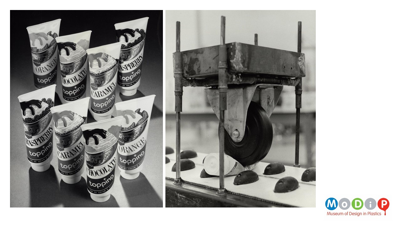
Cascelloid were also making polythene collapsible squeeze tubes. They started production in 1954 in small quantities, but didn’t enjoy the immediate success that the other bottles did, however by 1965 a whole factory at Stamford was given over to their production.


Returning to the original Sqezy bottle.

The containers with the metal ends were known as Cascapak and were sold as being able to withstand 200,000 pressures and releases. As you can see in the image below, both ends could have a different metal fixture depending on the product’s needs. They were promoted to brands as being able to keep their shape and so keep the brand name clearly legible and undistorted. They were promoted as having Poster-like quality, that was eye-catching and had ‘shelf appeal’ to the consumer. The bold print in up to 4 colours was clean and crisp. Polythene offered a key on the surface of the material on to which fine detail could be achieved with the contemporary printing techniques available. The indelible inks that were used didn’t crack, flake or rub off.

This image shows a brochure which came to us as part of the BXL archive and is fascinating as it asks their customers – the producers of the food, pharmaceuticals, cosmetics, and household products to ‘Consider the economies in transport costs’ that these lightweight and unbreakable bottles provide.


Next are a series of images which are not the best of quality – they are scans of photocopies that are part of the BXL archive, and unfortunately, we don’t have the original images.

Firstly, the extruded tube for the sleeve is cut to length. Different sized containers could be achieved by lengthening a standard diameter tool, meaning no retooling is required. The lady in the right-hand image is attaching the one of the end plates before the tube is printed. For powder content the tube could be filled before adding the top plate.


The below images show the printing process. It looks like the top plates are already in place on the tubes as you can see on the conveyor belt in the centre but the bottom plates are not.


The next set of images were labelled as ‘final spin, test, and pack’, the spin referring to the screwing in place of the metal end plate.


Housework was hard work so the Sqezy product was advertised as making it easier to do the washing up. Some people think that the phrase Easy Peasey Lemon Squeezy comes from the Sqezy advert, but it might be a misremembering of the strap line shown here ‘It’s easy with Sqezy!’


The image below, which has been recently acquired by MoDiP shows a page out of an Ideal Home magazine from 1960.

‘Quick as a wink away from the sink.’ This is aimed at the housewife.

What is fascinating about both of these adverts is the fact that the bottle of Sqezy is shown with its print upside down to make it look more attractive on the page. Of course, with the introduction of the silicone valve we are used to seeing products in squeeze to use bottles with their lids at the bottom but at this time the bottle would have been firmly placed the right way up to avoid leakage.


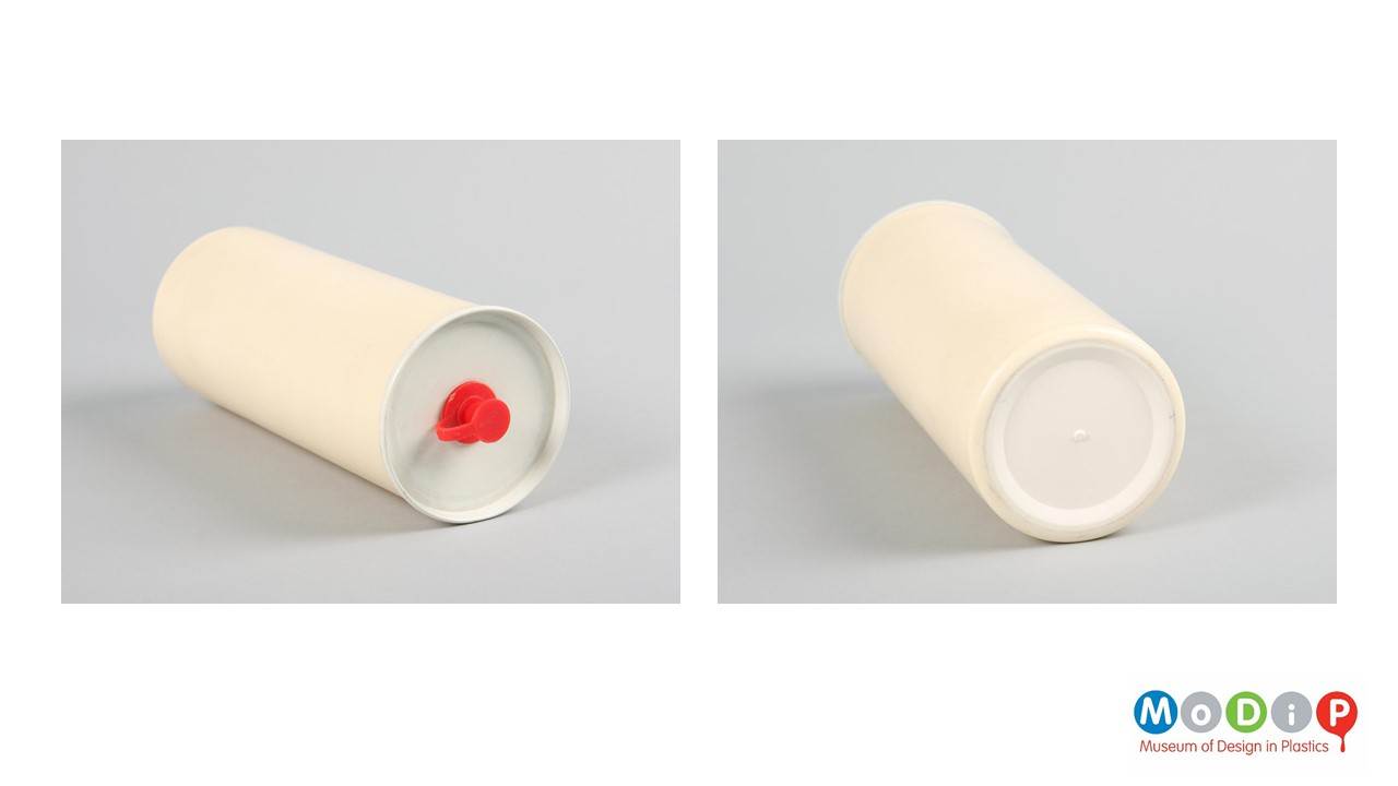
These metal-ended bottles were a huge success from when they were launched in 1956/7. However, over time the price of polythene was substantially reduced and from that point suppliers of detergents wanted blow moulded polythene bottles. This is a blank example in the MoDiP collection which has a blow moulded base and a metal top, like a hybrid bottle – whether this is easing the consumer or the manufacturer towards the wholey plastic bottle I am not quite sure.


I thought I would take the opportunity to show a range of Sqezy bottles in the collection. These ones date from the 1960s. As we run through the next couple of decades we will see that the strength of the branding is clear. Yet, the bottle shape becomes more generic.

 These bottles date from the 1970s…


…. And finally, the 1980s.


Below are some toys that were made under the Cascelloid of Palitoy name.


Here is a range of shaped bottles made by Cascelloid for HAX and designed by Edward Hack. The fish shaped bottle would have contained lemon juice to put on fish rather than fish flavoured syrup.


And here we have a small group of wooden models for Zoo glue. The red elephant bottle is the final piece.


Despite the fact that the packaging of liquid is necessary, inevitably the Sqezy bottle has proved to be an indicator of the longevity of plastics in the oceans. These images have been accompanied by the headlines: 

  • A plastic washing-up liquid bottle that is at least 47 years old has been found on an Isle of Man beach, just days after a similar find in the UK.
  • Bottle’s 50-year swim shows scale of plastic crisis.
  • A 70-year-old plastic bottle which contained Britain's first washing up liquid has been found in Stamford.

These should be indicators of the hidden value of plastics, and the need to keep materials in the system through recycling. Of course, at the time these bottles were in use the idea of recycling was in its infancy, and the recycling of plastics products was limited.


Louise Dennis, Curator of MoDiP


Wednesday 23 June 2021

Classic design: Ericofon

In March, MoDiP was invited by the BPF to provide a short series of webinars about classic design inspired by objects in the MoDiP collection.

The object or objects that have inspired the third talk was the Ericofon telephone. With its distinctive shape, hidden dial and cut off button underneath the device.

Ericsson was originally established by Lars Magnus Ericsson. He started off working for a company that made telegraph equipment. Opening his first telegraph repair shop in 1876, then selling his own telephone equipment in 1878. After expanding the company worldwide Lars Ericsson stepped down in 1901. Click on the iimages throughout this post to enlarge them.


Ericsson created the first Bakelite, phenol formaldehyde, telephone, the DBH1001 which was introduced in 1931 the design is attributed to the Norwegian artist Jean Heiberg. This was followed by a redesign in 1947 by Gerard Kiljan.

The move away from other materials to plastics – with Bakelite being the vanguard – was revolutionary for the industry – it is suggested that the time it took to make a telephone case was reduced from one week to seven minutes by changing over to compression moulded phenol formaldehyde.

Although the American company Automatic Electric had made a phenol formaldehyde telephone in 1925 – it still had a metal cradle for the handset. This Ericsson phone was the first phone to be made completely out of Bakelite with the cradle being integral to the body. This wonderful material, as we saw last week with the A22 radio, could be formed into attractive curved shapes. It was also more hygienic than metals and woods that had been used before – because it would not absorb moisture and could be easily cleaned.


There are two other phones that Ericsson are particularly known for: The Dialog and the Ericofon.

Below is the Dialog which looks very similar to the GPO phones that many of us are probably familiar with.

This phone was released in 1964, having been designed by the Swedish Architecture and design company AOS and millions were sold from then until the 1990s. Apparently, the King of Sweden was presented with a handmade version for his 40th birthday in 1986.

A push button version was introduced in 1972 but was not as popular as the rotary dial version. The usual design processes were utilised – to make sure the receiver fitted the average face, and ensure that the handset was not too heavy to hold for too long. But I think the most interesting design element that I hadn’t come across before was to make sure that there was enough light entering the case, if it were too dark inside it might be a cosy place for insects to inhabit.


Moving on to the Ericofon…

It has its origins in the candlestick telephone which was in common use from the 1890s through to the 1940s which was made of a number of different materials including wood, brass, and phenol formaldehyde.

The candlestick obviously had an influence on Siemens ‘Crouching dog’ model 29 telephone from 1929. This device was not mass produced with only 500 being made. It has a small foot print but is relatively tall leading to it falling over at lot during testing. However, what interested the Ericsson team was the fact that the earpiece, speaker, and dial are all in the same unit.


Ericsson’s technical director, Hugo Blomberg was particularly taken by their competitor’s device. He worked with designer Ralph Lysell to produce their own version. Many clay models were created by Lysell during the design process. The main goal, like we saw with the Panton chair in our first talk, was to create a telephone case in a single piece. Other companies had tried to achieve this but had not managed to complete their projects. The physical visualisation of the device made it easier to persuade Ericsson to persevere. Producing a product in as few pieces as possible means that there is less finishing required. There is no need to fix multiple pieces together and there are less edges to finesse making for a quicker process.

Two models were selected for further development. However, parallel projects, and the outbreak of the second world war which caused restrictions on resources, meant that work was halted until the late 1940s. At this point, Gösta Thames was brought in to lead the project, he had been successful in designing a loudspeaker phone which had all the components in a single unit. This product was large, so to create a small, lightweight, table or desk top device the componentry needed to be shrunk.

 
The timeline below shows the history of the device which had initially been called the Erifon by the team working on the project – this name brought together the first three letters of the company and the Greek word for sound. When the team came to register the name, they found that it was already used for a fire-proofing product for textiles. This meant they had to find a new name so they simply added the abbreviation for company in the centre to make it Ericofon. The Swedish public christened it the Cobra phone due to its shape. It was the first Swedish phone to be given a name rather than a code of letters and numbers. This of course helps to make it memorable for the general public.


Although the initial intention was to create a single piece phone case the original consumer product was actually moulded in two mirror halves that were then glued together. The cases were then polished by workers to make sure then glue seam was less visible.

The original design can be seen on the left-hand side of the top left image, and has since become known as the ‘old case’. The early 1960s saw a subtle redesign, known as ‘new case’. This new case was single piece although still has a central seam. This seam is caused by the two-part mould rather than a glue seam. In an interview with Gosta Thames he suggested that this came about because the case could now be ‘spray-moulded’ in a single piece – and I wondered if this is a correct statement – I think that spray-moulding is more associated with composite materials. Perhaps this has been translated incorrectly for injection moulding – if anyone has any insight please do get in touch so that we can make sure we have our cataloguing of our objects correct.

The flat earpiece was not redesigned straight away. It was later made wedge shaped as the steeper angle meant that the user held the phone too close to their face.

Gosta Thames stated that his starting point in choosing a shape was always that the phone had to be easy to hold. It should be light and feel comfortable in the hand. You had to be able to feel how to hold it even in the dark.

For me, the intended grip shown in the right-hand image is really interesting. You can see that it makes perfect sense because the main weight will be in the base but I don’t think it is an intuitive way of picking up a telephone – I think it would be more natural to hold the phone like you would a ‘normal’ phone receiver.


The exciting thing about the phone was not just the dial being in the base and the ease of answering by simply lifting the device, but the colours that were available. In the American market there were 18 colours available and they were not just red, blue and grey. They were exotic colourways such as golden glow, Nordic blue, Sahara, dusty rose, chartreuse, accent green, princess pink, mandarin red, Aqua mist, Riviera, Sandal wood, Royal dubonnet, charcoal, crystal mint, Persian grey, wedgewood, candle glow, and taj mahal. These fabulous colours were achievable because of a new material which was released in 1954. Other materials were considered including acrylic, cellulosics and even phenol formaldehyde. Once Acrylonitrile butadiene styrene became available it became clear that it was the material of choice for this device and most phones that have followed due to its rigidity, resistance to impact, and durability. Most significantly it had the ability to take colour well, with an opaque and glossy surface.


I really like the image below as it shows some of Ericsson’s phones from the 1930s to the 1970s. The Ericofon looks outstanding in amongst their other pieces more conventional looking products.


The Wikipedia page lists the media appearances made by the classic design – it is really interesting to see the variety of programmes and films and the longevity of the design.
 
The next two images show some of the other phones in the MoDiP collection.


Wild and Wolf produced a number of classic telephone design reissues in the 2010s. For a number of reasons including changing componentry means that the reproductions don’t feel the same as the originals – the trimphone for example shown in the top right does not hang as satisfactorily as the original when it is picked up from the handset cradle.

Interestingly, the Wild and Wolf devise is not known as the Ericofon but as the Scandi phone – perhaps they didn’t get the permissions they expected.


Louise Dennis, Curator of MoDiP